The existing SF Next Muni app seems to have been abandoned and is not very good with SF buses. The Tidbyt Transit app doesn’t cover SF busses at all. Two important asks:
allow users to select more than one bus line to be displayed.
pretty-up the UI. Current is hard to read (see screenshots)
Hi Tim! What makes you believe the app is abandoned? Have you tried reaching out to the volunteer developer who maintains this in their free time with your feature requests? Community apps are open source, so you could also send a PR to community/apps/sfnextmuni at main · tidbyt/community · GitHub to propose your improvements…
No worries. These forums aren’t really the most reliable way to contact anyone specifically, I guess.
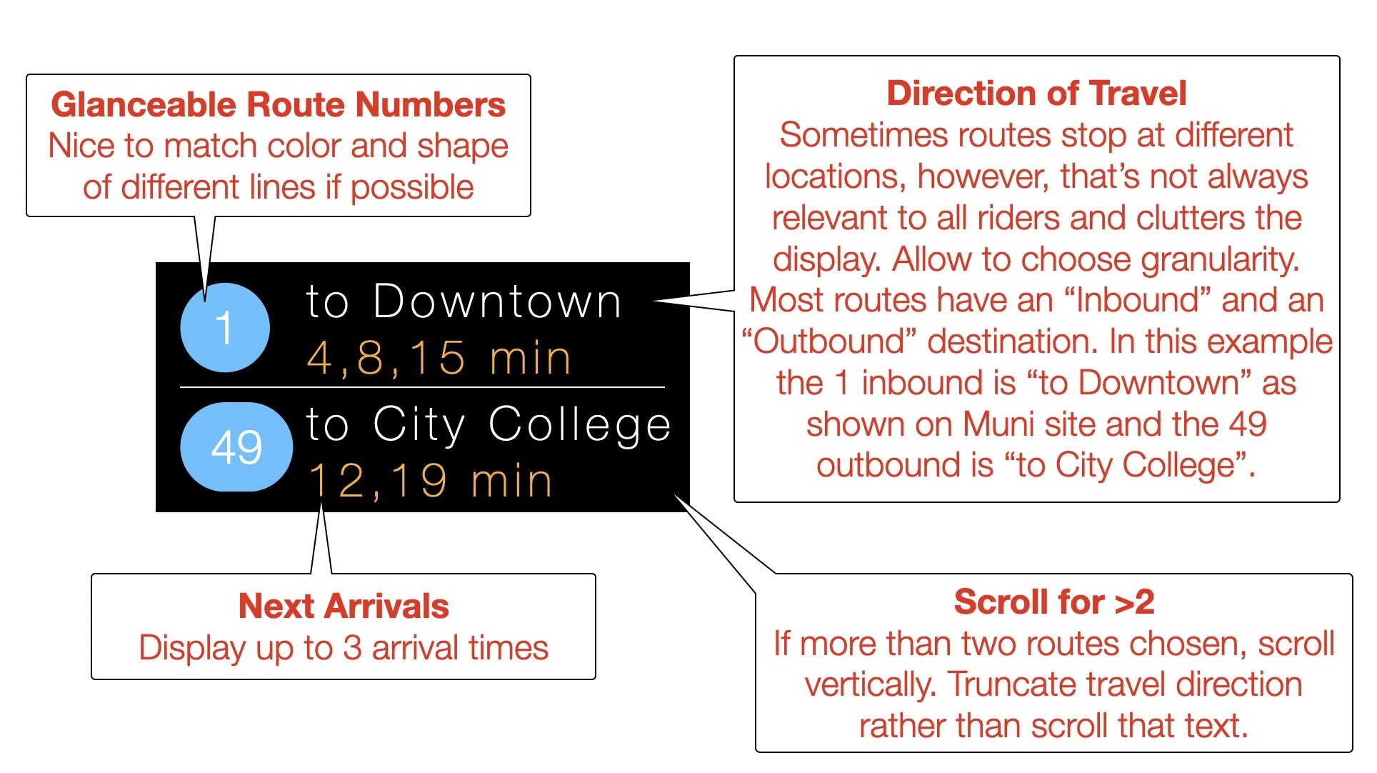
Have you tried adjusting the display settings in the SF Next Muni app? I agree that the screenshot you posted here leaves a lot to be desired UI wise. But the layout is quite customizable in the settings - based on past feedback it turned out that the ideal layout depends quite a lot on which muni stop you’re displaying, and unpredictable things like how many lines stop at that stop, how wordy their destination name is, etc - and so the app grew a bunch of customization options to allow users to make their display work best for them. Perhaps this is an opportunity to add some more options, if they’re not already there.